
- Posted by: blignos
- Published: 02-12-2021
- Category: Latest news
4 types of custom reports could save you up to 30 hours/week
The ability to gather data is an everyday, essential task for businesses active in sectors such as Security, Aviation, Facilities Management, Accommodation, Hospitality and many more. But what good are they if people don’t have the time and the way to gather them and get insights from them?
Data, data & data
Employees of organizations of all sizes have to deal with data inputs on a daily basis and spend almost their whole workday on bringing them to readable formats. The issue in that case, is not only how to gather data but how to access them, turn them into insights and use them for decision-making throughout your career. The value is hidden and it can be easily revealed through an automated, time saving, visualized custom report.
Your current situation
It is part of our everyday experience to come through cases where the managers are using ineffective, costly ways to gather and analyze data pertaining to their everyday operations. Handwritten reports or vast excel sheets is the first and only indication you need to move on to a time saving alternative.
Using paper reports or countless excel files must be affecting your productivity and efficiency, being the exact opposite to “organize, program and save time.”
- 1 They are difficult to edit, analyze and share.
- 2 Most of the editing, importing and exporting is being performed manually.
- 3 It is very easy to miss data and files, and make mistakes.
- 4 They are not known for their user-friendliness aspect.
- 5 Even after the editing part, data storage is another unpaved way.
Your alternative
Below, you will find a list of 4 different kinds of custom reports which could actually save you up to 30 hours per week. Imagine automating everything? That’s it! Note also that you can find all the assistance needed to explore the possibility of using every element and value of your everyday operations, in an attractive, visualized dashboard created by our Business Intelligence tool.
- 1 Schedule related Dashboard
- 2 Incidents related Dashboard
- 3 Client related Dashboard
- 4 Mixed Dashboards
Our aim is to boost your creativity and help you find the hidden value in your everyday actions. That way, you will have the time to inspire your team, encourage personal growth and give your colleagues the space they need to overcome their biggest barriers and evolve.
Schedule related Dashboard
Through your QR-Patrol account, you have the ability to automate the routes of your employees and get informed about the state of each Schedule on a daily basis. Maximizing your efficiency and profitability would mean getting informed about the completion of each Schedule, just by receiving an automated email including the custom report.
The system will do the work for you, save you valuable time and turn your everyday operations into a visualized dashboard, thus serving as a decision making tool. Like that, you will be able to detect the weak spots in your services and improve on them.
This would allow you to provide even higher quality services to your Clients and boost the potential of your co-workers.
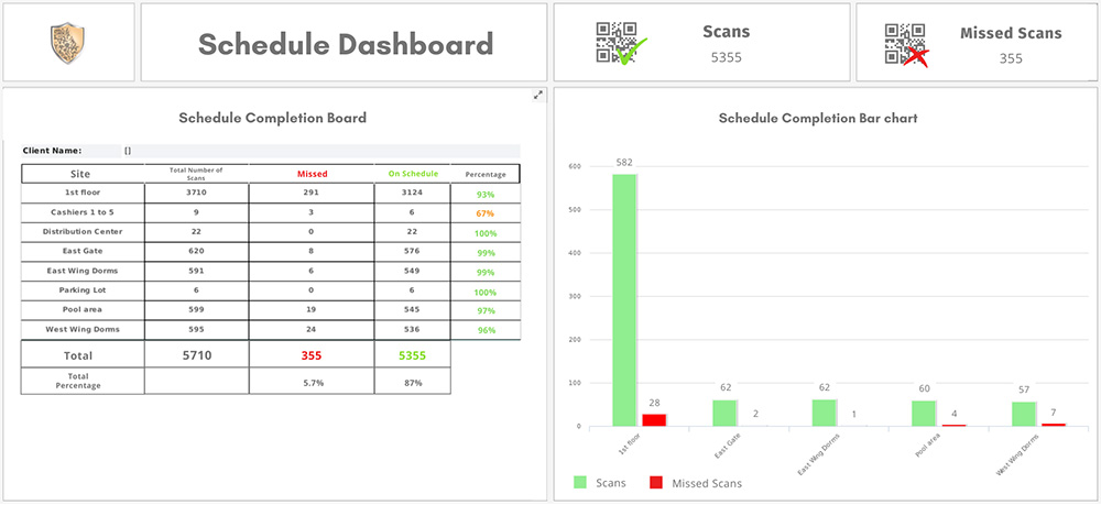
What you can see in the Schedule Dashboard is a table and a bar chart.
The Table includes:
 Sites / Clients
- Total number of scans performed
- Missed Scans.
- On-Schedule Scans.
- Percentage of Schedule completion (On-Schedule Scans vs Total Scans performed)
The Bar chart includes the on-schedule scans and the missed scans per site and Schedule.
Think about it. Wouldn’t that be something that adds value to your everyday operations?
Incidents related Dashboard
A creative way to see the whole picture of your operations and pain points is via an Incident Dashboard. Here you may find information related to the frequency and the types of Incidents, combined with specific locations and properties of your Clients.
That way, by a single glance you have all you need to improve your services and explicate the patterns shown visually in the custom report.
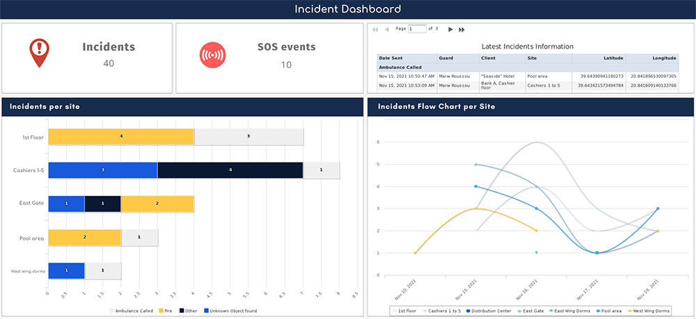
The Incident Dashboard is a great tool that enables you to see the “big picture.” Through the Table, the Bar chart and the Flow chart available within the dashboard, you can see information on all the types and frequency of Incidents over a specified time period per Client’s site allowing you to take accurate and tangible decisions related to your operations.
Interesting? Get in touch to learn more!
Client related Dashboard - Analytics
Have you ever felt that you are missing part of what’s happening to your Clients’ properties? Do you want to upgrade your services by being fully transparent to your Clients? A Client Dashboard – Analytics would be the best tool for you!
The system can gather all the information related to the Schedules and Incidents per Client and Site and include it into a single dashboard.
The next step is simple. You schedule the report to be delivered to multiple recipients and your Clients will receive a detailed Client Analytics report on a daily, monthly or even yearly basis depending on your and their requirements.
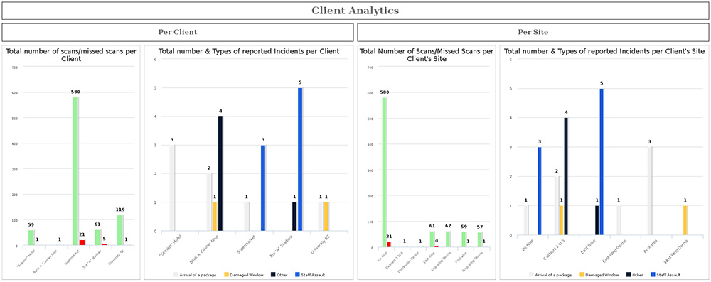
The Client Dashboard – Analytics includes 2 types of Bar charts with 4 charts in total:
- 1 Bar chart displaying the on-schedule and missed scans per Client
- 2 Bar chart displaying the total amount and types of Incidents per Client
- 3 Bar chart displaying the on-schedule and missed scans per Client’s site
- 4 Bar chart displaying the total amount and types of Incidents per Client’s site
Excited? Contact us to learn more
Event Activity Dashboard
Besides the real time management and the continuous data inputs, the 2nd equally important part of your operations would be the proper interpretation of the data in hand. Knowing that making sense out of vast data inputs can prove quite difficult and an everyday challenge for many companies, the Event Activity Dashboard serves as a crucial tool that could help them gather & interpret information in a structured and time efficient manner.
Stop spending time on checking events and data individually. Leverage, instead, the huge data management capabilities of the Event Activity Dashboard. Use its advanced, mixed, custom features to combine information related to Events, Incidents, Scans, Frequency, SOS Events. Deploy the Heat map chart to identify your “empty” spots and grow your company’s potential.
- 1 Extract, in a matter of seconds, visualized data analytics and save time
- 2 Data are being pulled automatically (live dashboard) and turned into colored charts
- 3 The custom dashboard can be scheduled to get delivered automatically to multiple recipients
- 4 User friendly live interface
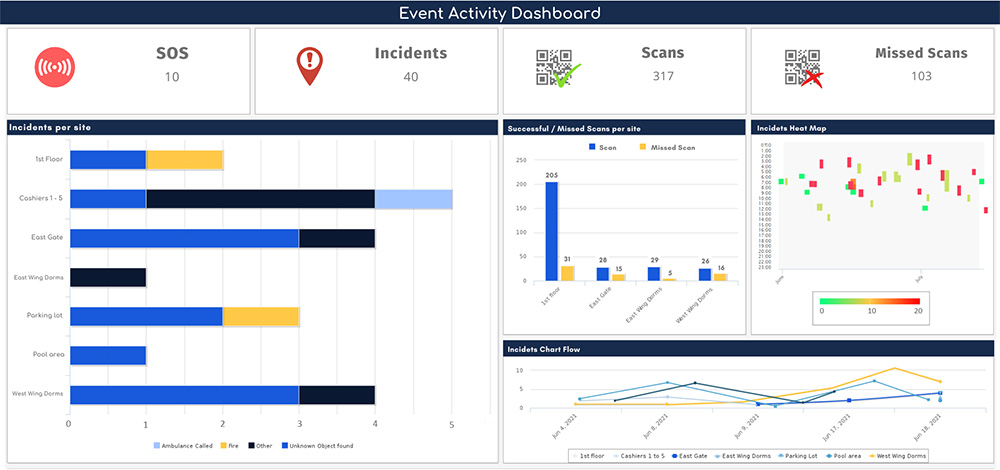
The Event Activity Dashboard includes:
- 1 Bar chart displaying Incidents per site
- 2 Bar chart displaying On-time & Missed scans
- 3 Heat map chart displaying Incidents’ frequency and quantity
- 4 Flow chart displaying Incidents per site
Contact us now and have it ready in your account, in no time!
Written by Michael Parmazis in collaboration with Pavlos Sopikis